Most doormat reprints do not happen because the mat was made wrong. They happen because the artwork was never suited to the material or the print method in the first place. A logo that looks crisp on a screen at 100 percent zoom can turn muddy on a coir weave, and a photo that prints beautifully on a poly-topped mat can look like a smear on natural fiber. If you sort out a handful of specifications before you send a file, you skip that whole loop. Here is how to think through each decision in the order that actually matters.
Start with the print method, not the picture
The single most useful thing you can do is decide how the mat will be decorated before you finalize the art, because the method sets hard limits on what the art can be. Natural coir and other coarse fibers are usually decorated by spray-dye or screen printing: dye is pushed onto the surface through a stencil. That process is excellent for bold shapes, chunky lettering, and a small number of flat colors, but it cannot reproduce photographic gradients or hairline detail, because the fiber is uneven and the dye spreads into it. As a rough guide, treat strokes and gaps thinner than about half an inch as unreliable on coir; they tend to fill in or break up.
Poly-surface and needle-punch mats are a different animal. They take dye sublimation, where a full-color image is heat-transferred into a polyester print layer. That method handles photographs, gradients, and fine detail, so if your design depends on a soft color blend or a detailed illustration, you almost certainly want a poly-top mat rather than raw coir. Rubber and PVC mats sit at the other end: they are typically molded, debossed, or fitted with a printed inlay, which suits solid one- or two-color logos more than anything painterly. Matching the art to one of these three lanes at the start prevents the most common disappointment, which is expecting photo detail from a fiber that physically cannot hold it.
Size the canvas and protect a safe area
Custom mats cluster around a few standard footprints, and knowing them lets you build the file at the right proportions from the beginning rather than stretching art later. The four most-stocked sizes run from a compact 18 by 30 inches up to a large 36 by 60 inches, and the jump in print area between them is bigger than it looks.
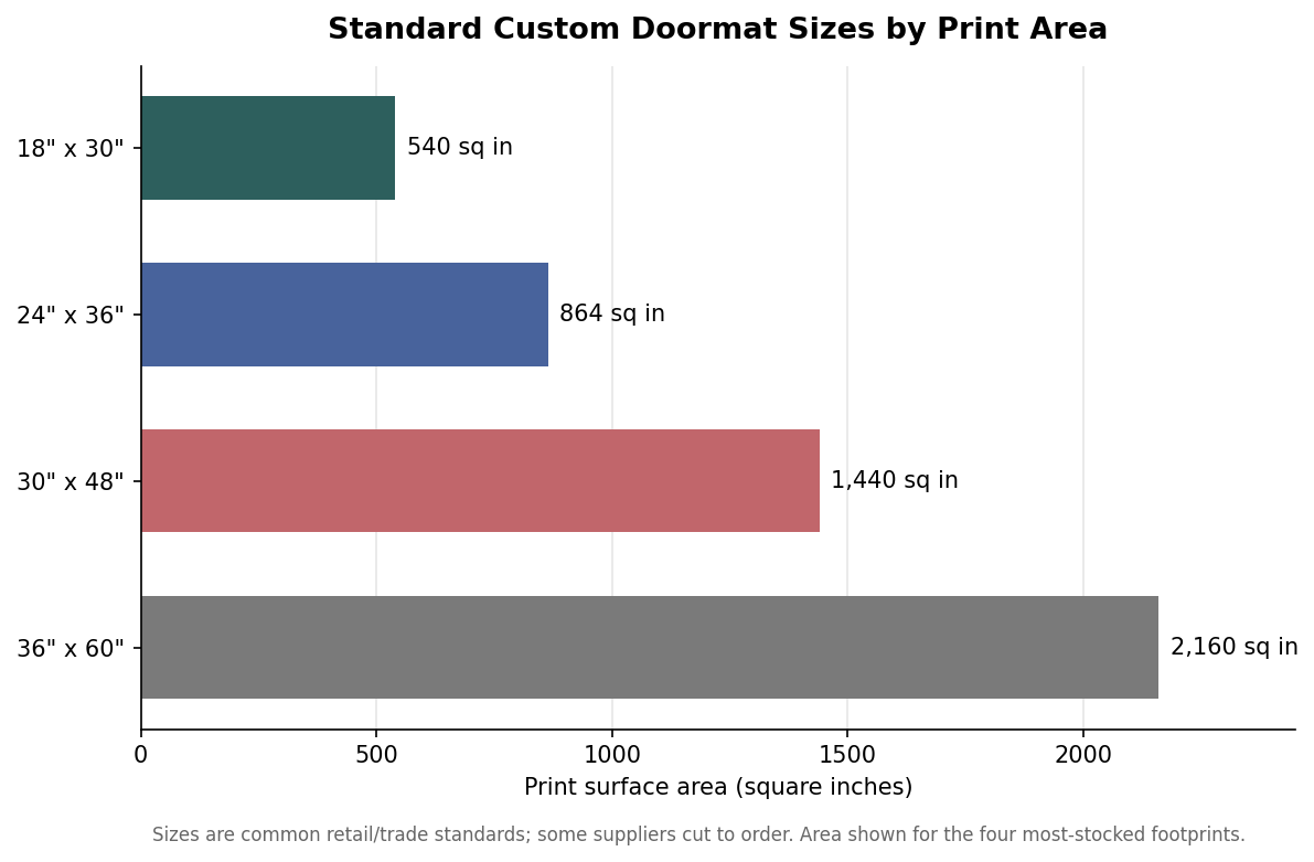
Whatever size you choose, keep the important elements inside a safe area inset roughly one to one and a half inches from every edge. Many mats have a molded or woven border, and cutting, binding, and the edge of the print zone all eat into the outer margin. If your text or logo runs too close to the edge, part of it can land on the border or get trimmed. At the same time, if the design is meant to reach the edge, extend the background past the trim line into the bleed so you do not end up with a thin unprinted stripe when the mat is cut slightly off-center. Design for the safe area, bleed the background, and you cover both failure modes.
Resolution, color, and file format
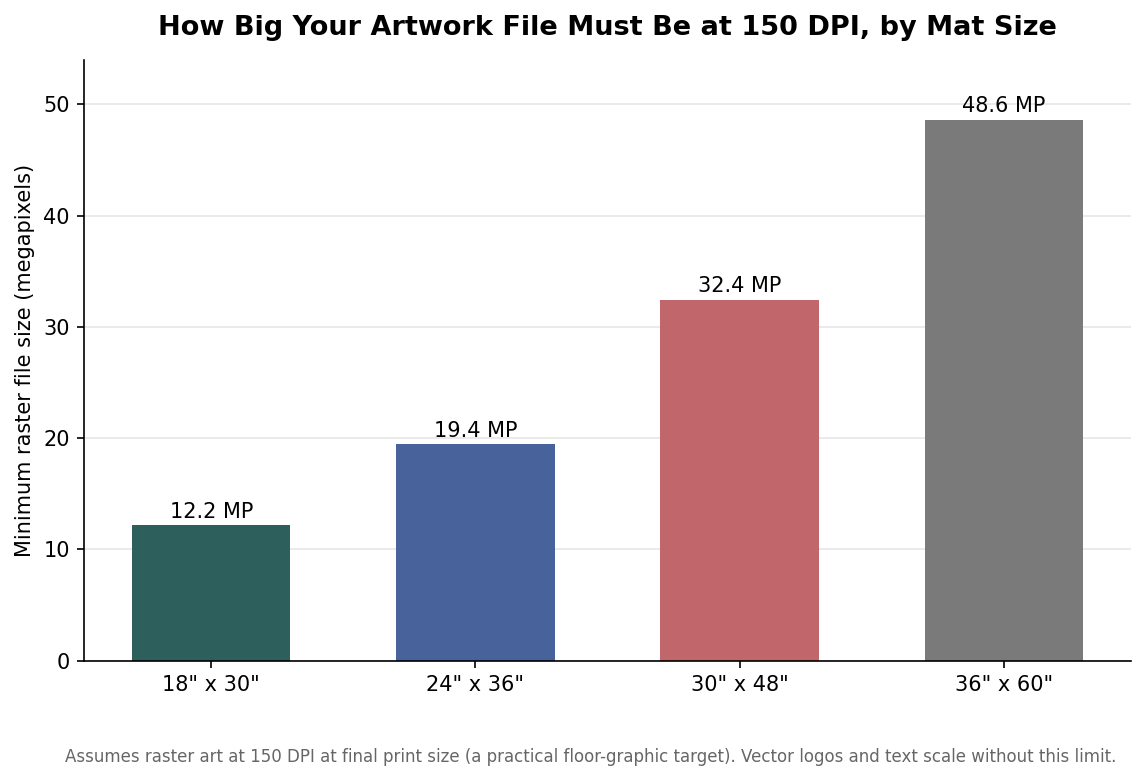
For anything with clean edges, a logo, lettering, a monogram, or a line illustration, vector files win every time. An AI, EPS, PDF, or SVG scales to any mat size without losing sharpness, so a single vector logo works as well on the 18-inch mat as on the 60-inch one. When you only have a raster image, the question becomes whether it has enough pixels for the final size. A practical target for a floor graphic, which people view from standing height rather than up close, is about 150 dots per inch at print size. Translate that into the file dimensions and the requirement grows quickly with the mat.
Color is the other place files go wrong. Screens show color in RGB, and some of the brightest RGB values, the electric neons and backlit blues, simply cannot be reproduced with dye and will shift toward a duller neighbor in print. Check how your colors behave in the print color space before you commit, and remember that on natural coir the tan fiber shows through and warms every color placed on it, so a cool gray can read as beige. Because a mat is seen from several feet away and collects dirt as it works, lean on high contrast and heavy letterforms. Text you want to read from a standing position should be generously sized, on the order of one and a half to two inches tall as a floor, not a ceiling; thin script at a small size is the first thing to disappear.
The mistakes that trigger a reprint
A short list of errors accounts for most do-overs. Thin outlines and small text on coir top it, because the weave swallows fine strokes. Low-resolution source images come next, usually a logo pulled from a website or a screenshot that looked fine on a phone but falls apart enlarged to two feet. Low contrast is a quiet killer: a mid-tone design on natural fiber can look washed out the moment it is dirty. Full-bleed art sent for a mat that actually has a border gets clipped. And the broadest mistake is a mismatch of ambition and material, expecting a photograph to survive on a surface built for bold shapes.
Before you send a file, it is worth running a quick mental pass. Confirm the decoration method and that your art fits what it can hold. Confirm the mat size and that your file is either vector or has enough pixels for that size at roughly 150 DPI. Confirm your elements sit inside the safe area with the background bled past the edge, that your colors are ones dye can actually hit, and that your smallest text is large and bold enough to read from where a person stands. Numbers like the half-inch minimum stroke and the 150 DPI target are indicative rather than absolute, and a good printer will flag a borderline file, but clearing them yourself is what turns a single proof into a finished mat instead of a second attempt.